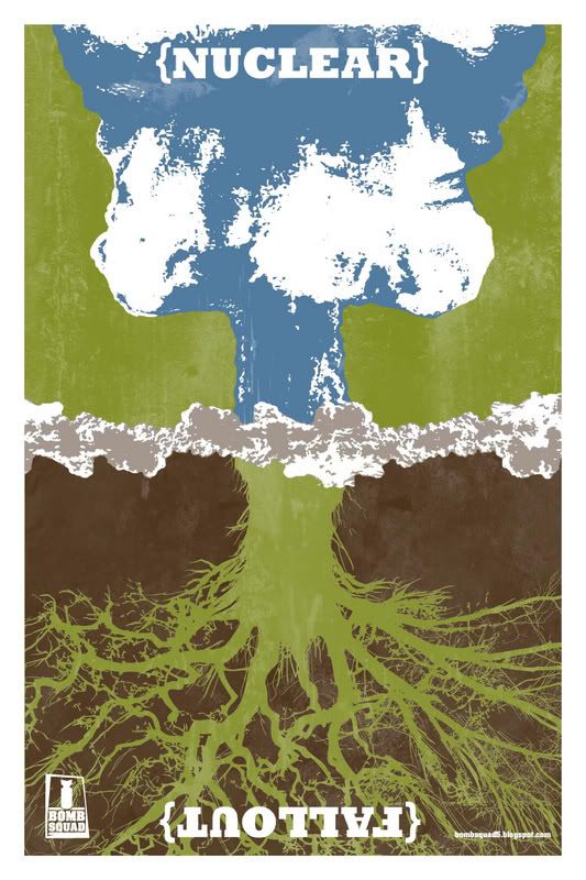
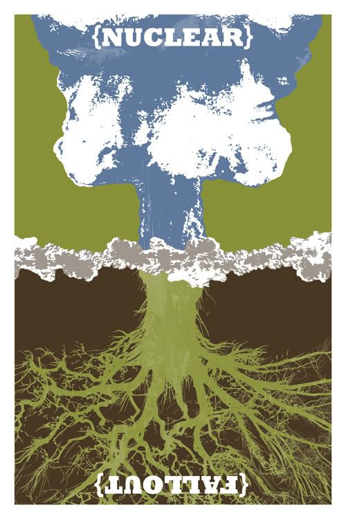
Here is my final solution for the Bomb Squad5 poster project.
Because you can't see my Designer Statement from the image it reads as follows:
"Nuclear weapons are a constant threat to our planet. Nine countries in the world openly claim to have nuclear capabilities and consider these weapons a major part of their national defense and foreign policy.
I have spent many hours researching topics related to nuclear weapons, from the concept behind their creation, the decision to detonate, and the declared number of nuclear devices found in the world today. My research led me to the devastating consequences scientists expect if these weapons are ever unleashed on the world. My project name, Nuclear Fallout, represents one of the worst consequences of the use of nuclear weapons.
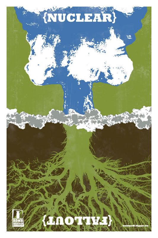
While designing my poster, I focused on the duality of nuclear weapons, including their use for national protection and their possibility for global destruction. The detonating mushroom cloud represents nuclear weapons and the root system represents nature and our habitat. I then concentrated on nuclear weapons’ possibility to devastate our ecosystem, economy and way of life. The roots are also a representation of how nuclear weapons have ingrained themselves in many countries’ foreign policies and national security plans over the last sixty years.
Before nuclear disarmament can take place, we must first destroy the roots of our current polices and develop new global accords banning the possession, development and use of nuclear weapons by all countries. I truly believe that global disarmament is the only hope we have of a peaceful future.
Carl Gerhards, Graphic Designer"
I'm extremely happy with the way it turned out both in cocept and execution. There are some elements on the back side that I think could be a bit tighter, but overall I think that my message is pretty clearly illustrated.
Thank you for looking through my process and I hope that you enjoy the final design and message. Any comments are welcome.
Carl Gerhards

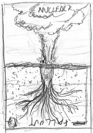
 Two Hours
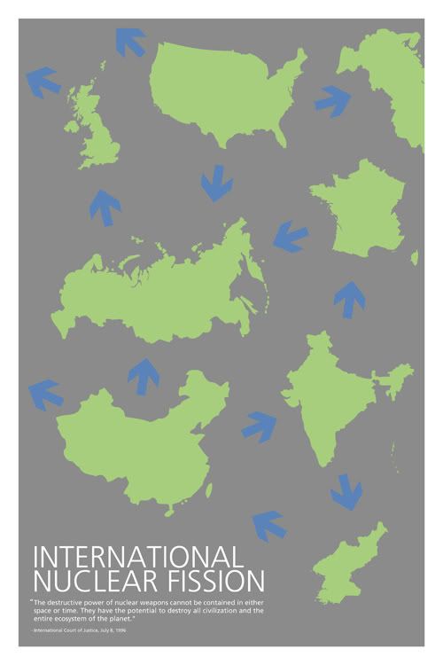
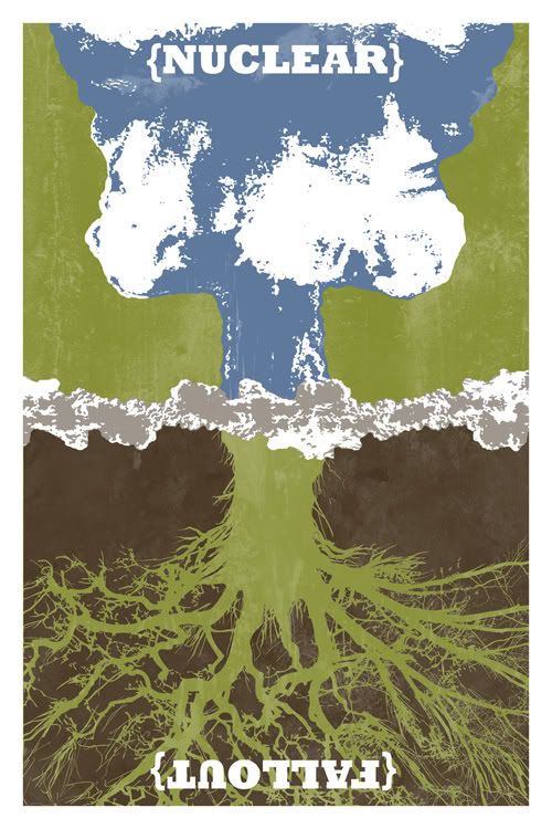
 Two Hours
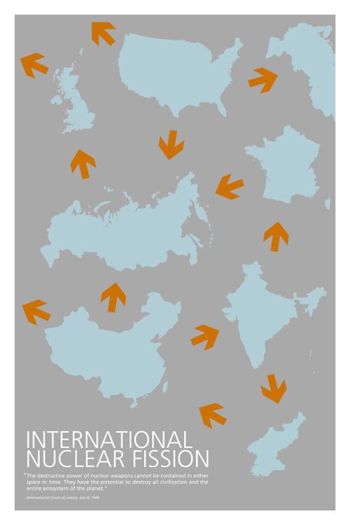
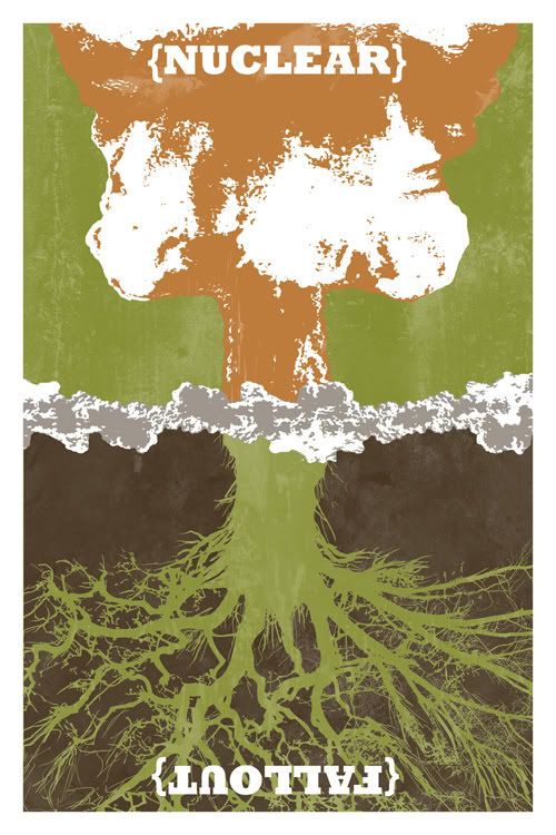
 Forty Minutes
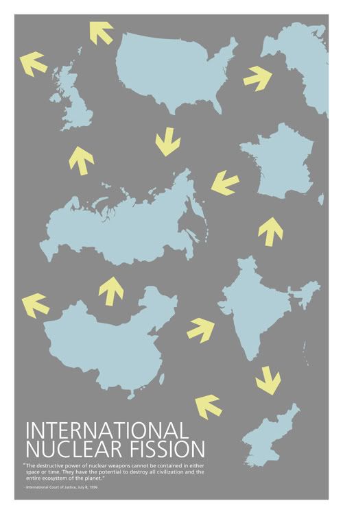