{NUCLEAR_FALLOUT}
Sorry about the lack of posting the last couple of monthes, I'm not sure if anyone is even looking at this thing anyway.
This assignment is for my Graphic Design Print Production Class. The assignment was to create a poster on the broad topic of nuclear weapons. We could take any stance we wanted but we had to work in a 12x18 format with three Pantone spot colors, and one mixed color from those spot colors. We also were told to leave a 1/2" border for laser printing. The poster will be folded into a 4"x6" mailer with one color on the back for address and any body copy we want to include. I'll post the back soon.
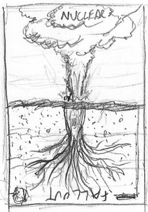 From all of my thumbnails, this was one of two that my professor picked. I agreed with him that it worked as a poster image. The nuclear mushroom cloud taking over the place of the tree says something about cause and effect, which is why I went with a very symmetrical reflected composition.
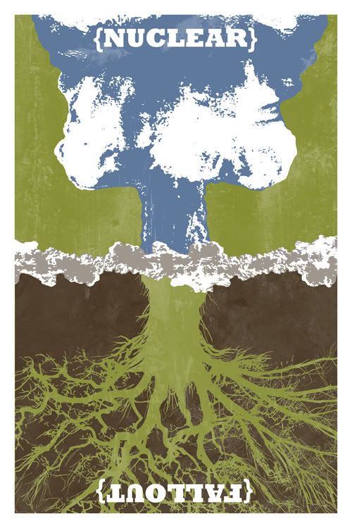 This was my first color version of the poster. I thought that the blue and white mushroom cloud kind of resembled a beautiful cloudy sky but still read as an explosion. I really love the colors and think that they do a great job of getting the viewer to look at the piece for longer and think about what it means. Although we're outputting this poster with a laser printer, I want to do a short run of hand screen printed posters for family, friends, and an online store I'm working on. I think that the image would make a great framed fine art print and would be a great conversation starter.
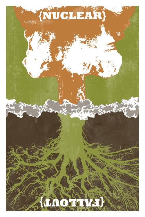 Not much different here other than an orange mushroom cloud. I like the colors here as well. This is a really easy change if I'm screenprinting.
More posts on this project coming this week.
This assignment is for my Graphic Design Print Production Class. The assignment was to create a poster on the broad topic of nuclear weapons. We could take any stance we wanted but we had to work in a 12x18 format with three Pantone spot colors, and one mixed color from those spot colors. We also were told to leave a 1/2" border for laser printing. The poster will be folded into a 4"x6" mailer with one color on the back for address and any body copy we want to include. I'll post the back soon.
From all of my thumbnails, this was one of two that my professor picked. I agreed with him that it worked as a poster image. The nuclear mushroom cloud taking over the place of the tree says something about cause and effect, which is why I went with a very symmetrical reflected composition.This was my first color version of the poster. I thought that the blue and white mushroom cloud kind of resembled a beautiful cloudy sky but still read as an explosion. I really love the colors and think that they do a great job of getting the viewer to look at the piece for longer and think about what it means. Although we're outputting this poster with a laser printer, I want to do a short run of hand screen printed posters for family, friends, and an online store I'm working on. I think that the image would make a great framed fine art print and would be a great conversation starter.Not much different here other than an orange mushroom cloud. I like the colors here as well. This is a really easy change if I'm screenprinting.More posts on this project coming this week.
posted by macworkerbee at 11:31 PM
![]()
![]()

0 Comments:
Post a Comment
<< Home