Fall Guide Cover Image
A magazine in Augusta, Georgia called Metro Spirit contacted one of my illustration classes and asked for an image for a Fall Guide cover. In the brief they mentioned the symphony and falling of the leaves amongst other things having to do with Fall. This was the sketch that I came up with.
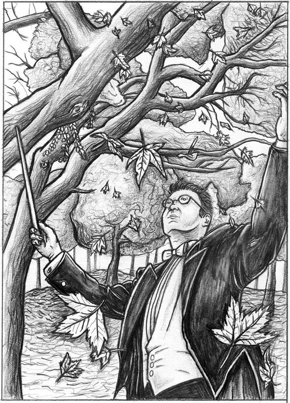
The magazine liked the sketch and asked me to complete the final along with two other illustration students.

It turns out that I wasn't chosen for the cover but two of my illustration professors thought the image would make a good New Yorker cover. I was very flattered when they told me to add the New Yorker cover logo and send a nice print of the image to the actual magazine. The mounted print will be on its way to New York this week, cross your fingers for me.


The magazine liked the sketch and asked me to complete the final along with two other illustration students.

It turns out that I wasn't chosen for the cover but two of my illustration professors thought the image would make a good New Yorker cover. I was very flattered when they told me to add the New Yorker cover logo and send a nice print of the image to the actual magazine. The mounted print will be on its way to New York this week, cross your fingers for me.


1 Comments:
I like this one, however, I have a small problem with the nose, the anatomy of the facial placement. Otherwise, looks great, hope it makes the New Yorker, that way if you get it, you'll know people and then you can get me in too...lol
Post a Comment
<< Home